A minimalistic coffee brand where the people are the logo.
Specialty coffee started dressing like craft beer: loud, illustrated, interchangeable. MAMAM didn’t want to join in.
MAMAM was founded in 2022 in Szczecin by five people with years in coffee: behind the bar, training baristas, roasting, buying green coffee, judging competitions. They came with a name, made of the first letters of their names, and one condition: don’t look like every other specialty roastery.
Roasteries in Poland were following the craft beer playbook: illustrated labels, bold colours, every bag trying to be the loudest, until they all start to look alike. A new roastery has to be recognised on café counters and shelves before anyone tastes the coffee, and looking like the rest makes that harder.
MAMAM wanted a minimal brand with one clear idea, pointing at the people and the quality of their work. The tone is just as plain: the tags call it “coffee for everyday use”.

I cut my first concept back to make room for the process.
I worked solo, directly with the five founders. My first direction was close, but louder, closer to my own visual language. At the first presentation the founders said it would compete with what they wanted to show: the roasting process and the delicate materials.
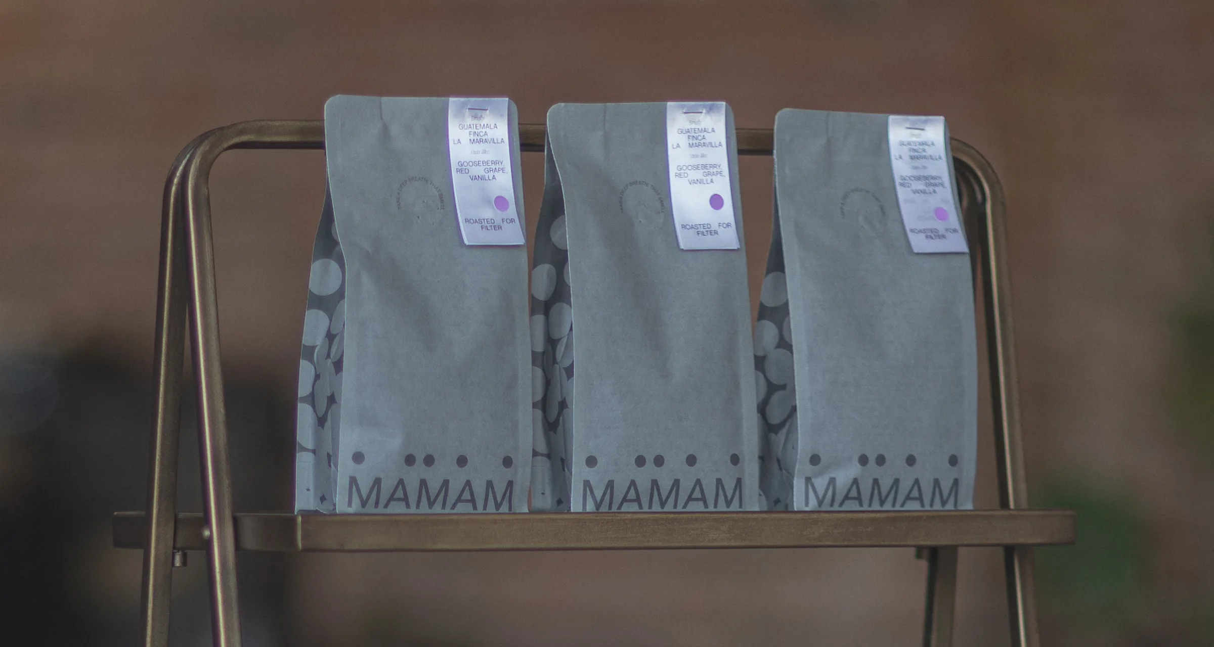
I took that as the brief, not as a rejection. The identity steps back: greys instead of colour, Neue Montreal with Migra Italic, soft paper, blind print on the business cards. That leaves the logo one job: carrying the people. From the first meeting to finished packaging took two months, with all five founders signing off.
Five dots, five founders. They move, but they never leave the name.
The key decision was to put the founders into the mark itself, not into a photo or a story on the back of the bag. Each dot under MAMAM is one of the five, the same people whose names make up the word.
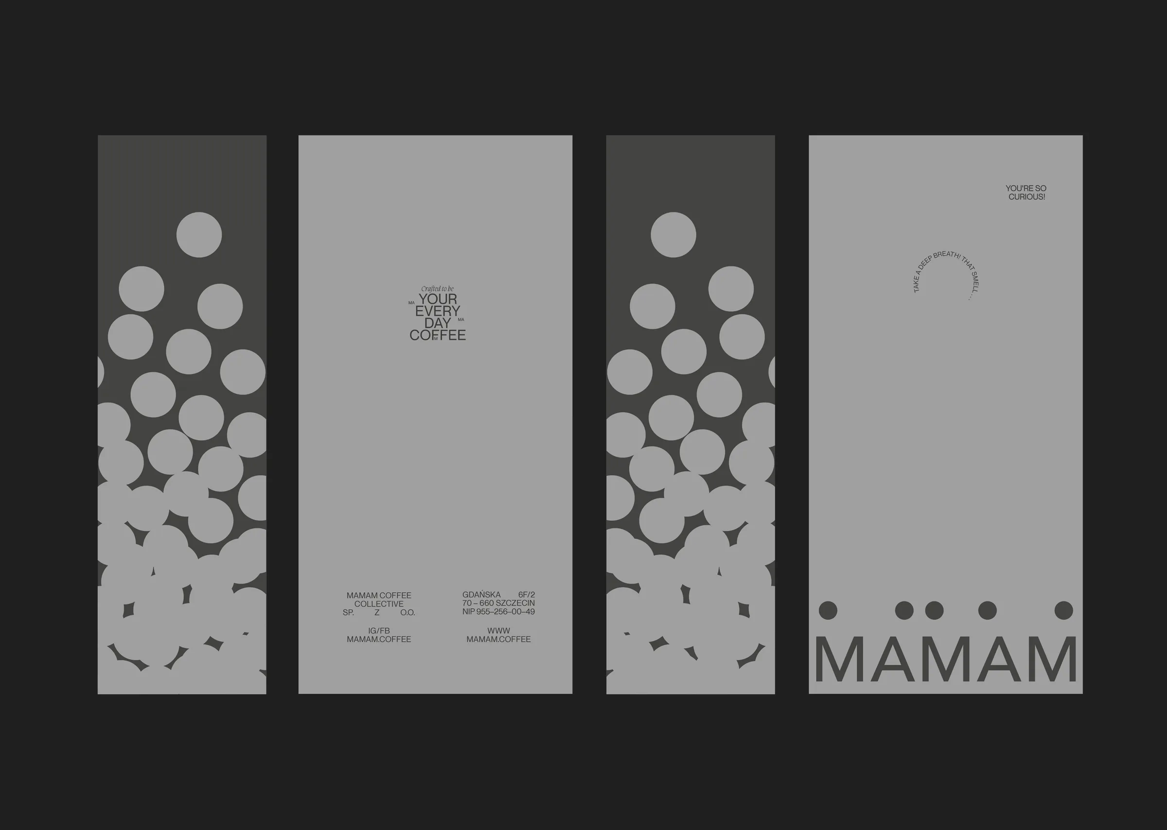
The idea was that the dots could slide along the letters in any configuration, but always stay with the name: someone from the team is always there, watching the roast. Read as beans, the same dots became the pattern on the bags, the cards and the socials, a quiet nod to coffee in a brand that never shows a cup.
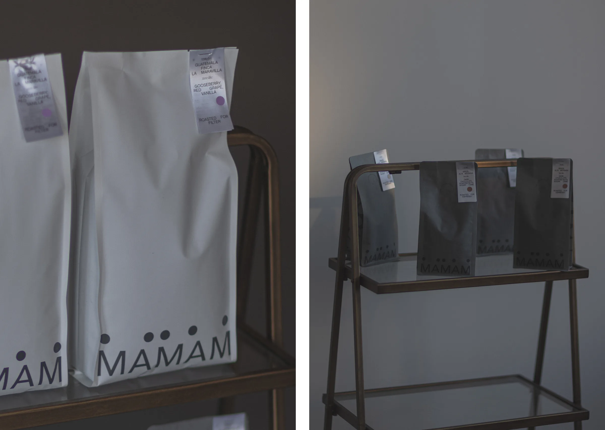
A tag on every bag made the brand shareable. It also made every batch slower.
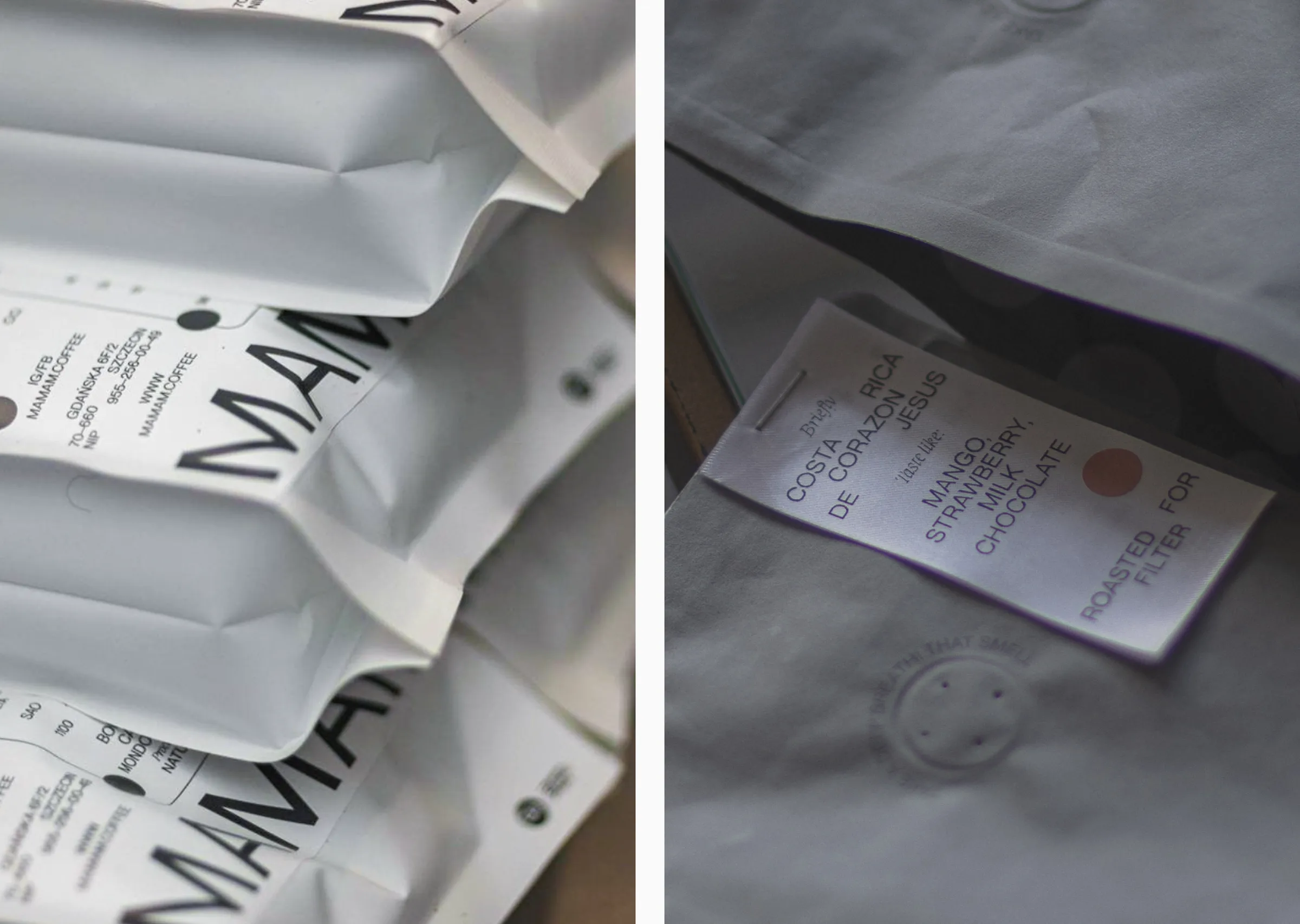
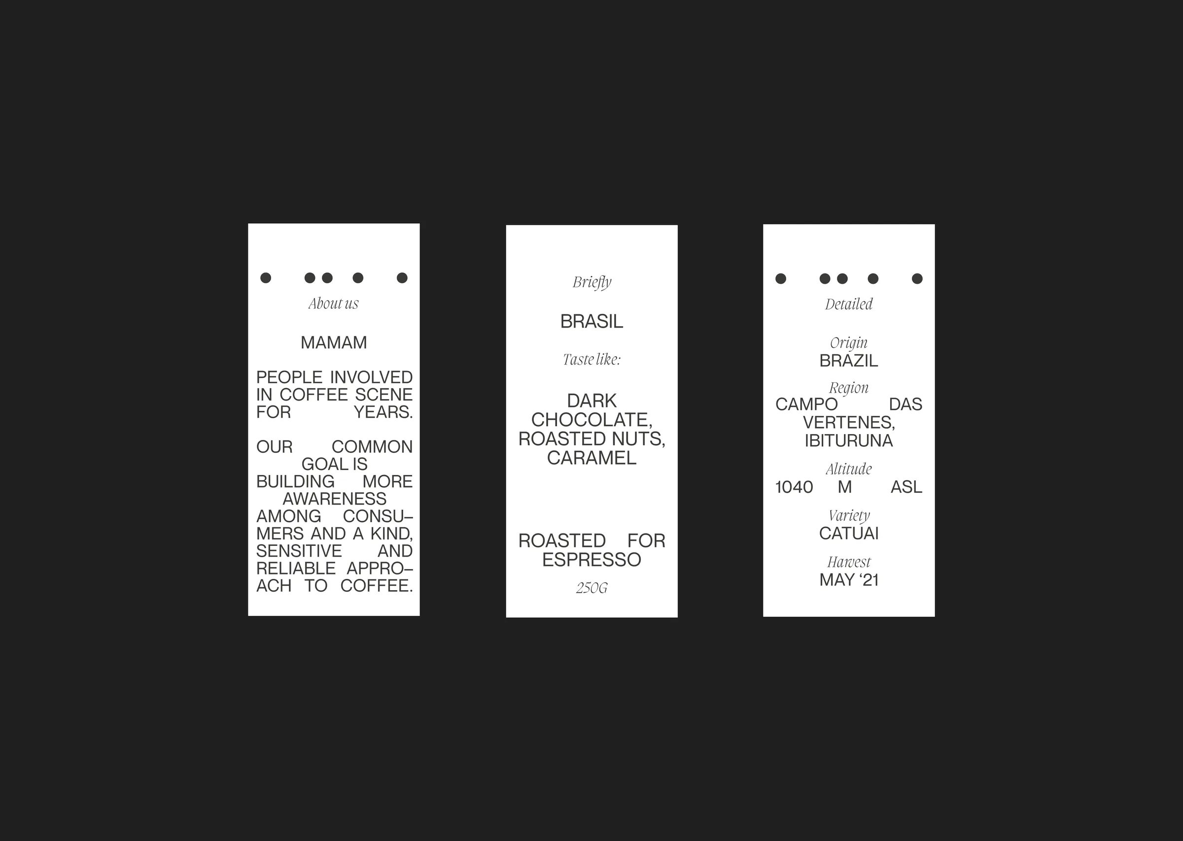
Each bag gets its own tag with the origin, tasting notes and roast. It’s the detail people photograph and post, and the most demanding part of production: finding a print technology that stays consistent from batch to batch took several attempts. The founders chose to keep it anyway.
The first packaging choice, semi-transparent bags, didn’t survive costing. The print was too expensive, so together with the founders we moved to opaque bags and let the tags carry the detail.
A good identity is one the client keeps building without you.
Four years on, MAMAM still runs on this identity. It has grown into a roastery known across Poland and in Europe, with its own online shop. They pushed the brand further on their own, toward the people, the process and their philosophy.
At trade fairs the stand gets dried flowers and grey tablecloths. The brand still holds together, now in their hands.
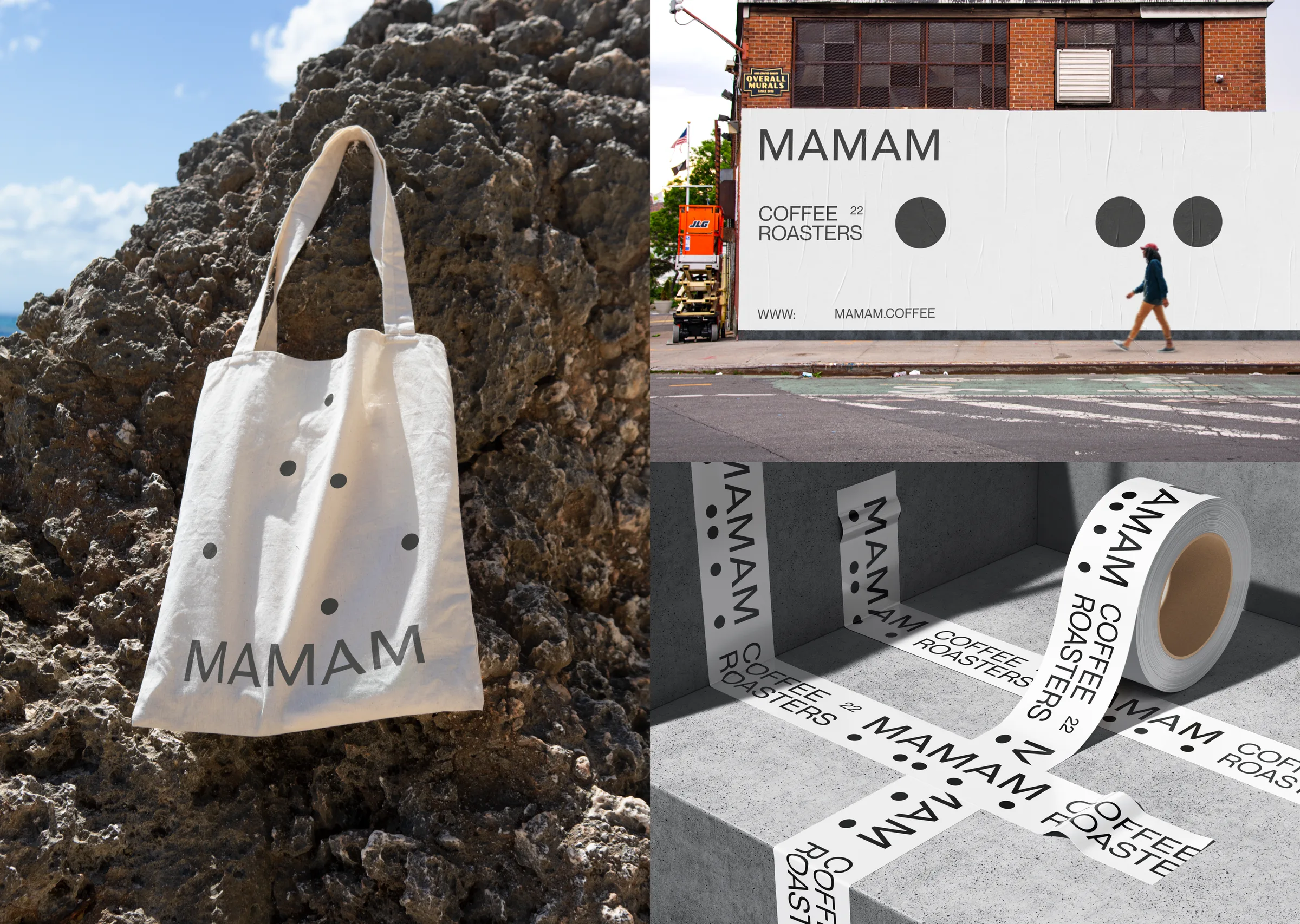
Ship the system, not just the logo.
The moving dots were the strongest idea in the brand, and the one I explored least. I delivered one main version of the logo and left the configurations, variants and uses for “later”. I held back in execution.
Next time the toolkit of variants goes into the first delivery, so the client starts with the whole system, not just its best frame.
Next projects